Heuristics Evaluation
Urban Outfitters
Type of project
App design
My Roles
UX researcher & UI designer
Collaboration
+ 2 UX/UI designers
Tools
Figma
Time
2 days
Picture by Cottonbro Studio
Urban Outfitters
The Urban Outfitters app is an all-in-one e-commerce app to facilitate user purchases of Urban Outfitters products.
Brief
My team and I were mandated to evaluate the usability of the checkout process of an existing digital product and redesign the screens within a flow, based on our evaluation and usability recommendations.

To redesign the UO app, we conduct a Heuristics evaluation. With the objective of improving the usability and user experience of the app, we knew that using this approach will provide us with a set of established design principles and will help us apply consistent adjustments.
Method
01.
Heuristics Evaluation
02.
Branding Assessment
03.
Screen Redesign
04.
Key Takeaways
Task Flow
By going through the current task flow of a first-time buyer, our goal was to identify any design elements that may be confusing or unclear to users to improve the checkout process.
After analyzing the user's current journey, we were able to identify seven areas for improvement that would enhance the overall efficiency of their experience.
We evaluated a purchasing task flow of the Urban Outfitters App using the following six of Nielsen’s Usability Heuristics:
Aesthetic and Minimalist Design
Home Page cluttered
Visibility of System Status
Filters not Visible
Error Prevention
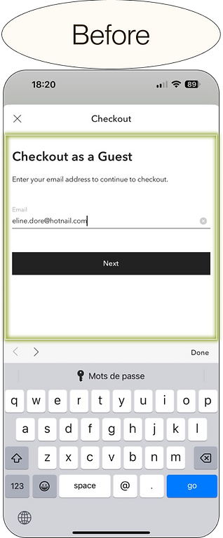
Buttons too Similar Email Error
Help Users Recognize and Repair Errors
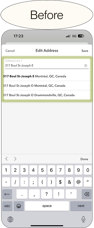
Address Error
User Control and Freedom
Shipping Error
Consistency and Standards
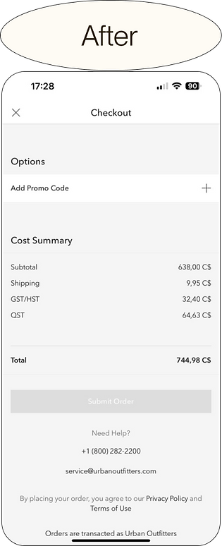
Additional Tax Field
Primary user: New buyer
Task: Buying clothing and home goods accessories.


Severity Scale
To prioritize the right usability issues and identify which problems are most critical and require immediate attention, we used a severity scale.
This helped us ensure that the most severe usability issues were addressed early on in the redesign phase, which can ultimately lead to a better user experience.

Prioritization Matrix
Now that we knew the scale of each usability issue, we placed each of them on a prioritization matrix to understand their relative importance or impact.
By seeing visually how each issue needed to be prioritized, we were able to improve our decision-making and ensure that our efforts were focused on the most important tasks or goals.

Branding Assesment
App Identity
To make sure that any redesigns are in line with the app's brand, maintaining consistency and building on existing brand recognition, we've decided to analyze the brand identity by extracting colours and typography from the App and the website with different tools. green is used for prevention messages.
Style
Very minimalist to let the pictures speak for themselves and inspire the users.
Tone
A professional tone is used to communicate information to the users.
Colours
The use of shades of black and white are aligned with the logo and red is used for error messages only, while green is use for prevention messages.

Screen Redesign
Home Page too clutered
Heuristic: Aesthetic & Minimalist Design
Level of Severity: 2
Having multiple categories means that every space is important on a homepage and having this layout of a big ad makes the experience of choosing a category less efficient for the user.
Solution
Accessible departments
The addition of all departments on the top part means that the temporary sales banner will show first no matter what department the user will click on.
Sales Hunters will be able to see the banner on all pages and may offset changes to the conversion rate based on size reduction for that kind of user.
Smaller sale banner
Reducing the banner size, but maintaining its presence keeps the opportunity to convert shopping users into buyers without losing users to scroll time and clutter in their shopping process.
.png)

Filters Not Visible
Heuristic: Visibility of System Status
Level of Severity: 2
Users need to know why they only see a few items. Not showing the filter prevents them from removing the filters easily and shopping for the items they were really looking for, which can impact the conversion rate.
Solution
Accessible active filters
We’ve added the filters’ names under a grey background slightly dark from UO's grey for better readability.
By adding filter chips, we ensure users do not get lost in the searching and filtering process, improving accessibility and confirming users’ previous actions.
Urban Outfitters is an inclusive brand and cares about all of its consumers, and this adjustment is align with the brand values and may improve brand perception for users with cognitive difficulties.
.png)
.png)
Buttons too Similar
Heuristic: Error Prevention
Level of Severity: 3
Users need multiple options when looking at their cart but at the moment, the buttons to edit, remove or save a cart are too similar, so users may press on the wrong option by mistake and have to go through the whole process again.
Solution
Bounding and colour to visually distinguish.
We’ve highlighted the filters’ names with a black contour so the CTAs can stand out.
By adding in colour and bounding to the options on check-out we ensure users do not accidentally click and make an action they did not intend to, ensuring their checkout process is as seamless and convenient as possible to avoid cart abandonment.


Email Error
Heuristic: Error Prevention
Level of Severity: 4
Receiving an email after buying an item is an industry standard. Currently, there is no error message for a common misspelling of hotmail.com so a lot of users won’t receive their order confirmation and that kind of experience might stop them from coming back.
Solution
Error message when the user hits next
Adding this message when a user doesn't enter their email address correctly provides clear feedback, helping them identify and rectify the mistake quickly. This reduces frustration, improves user experience, and increases the likelihood of successful communication or registration.
Usability icon
We added an error information icon to enhance the visual feedback, making it more prominent and easily noticeable. This visual cue draws immediate attention to the error, facilitating quicker identification and correction, thereby improving the overall user experience.


Address Error
Heuristic: Recognize & Repair Errors
Level of Severity: 3
User comes to the platform with the idea of buying specific items. Currently, when an item can’t be shipped, you get the error message but there is no clear way how to fix it, even when you enter an address that is recognized by the system.
Solution
Error message on provided addresses
Adding this message when users start typing the address and the system starts recognizing the provided address gives clear feedback, helping them identify and rectify the mistake quickly. This reduces frustration later on when the users will be at the checkout section.
Usability icon
We added an error information icon to enhance the visual feedback, making it more prominent and easily noticeable. This visual cue draws immediate attention to the error, facilitating quicker identification and correction, thereby improving the overall user experience.


Shipping Error
Heuristic: User Control & Freedom
Level of Severity: 3
To fix the previous problem, the only choice is to remove the item from the cart but there is no way to do that except for going back to the previous pages. Making the user leave the checkout page can have a significant impact on the conversion rate.
Solution
Accessible call-to-action
We’ve highlighted the filters’ names with a black contour so the CTAs can stand out.
Offering users alternative choices, enables them to explore different options and potentially find a suitable solution. This empowers users with more control and flexibility in navigating through the issue, leading to a more satisfactory experience and a higher chance of resolving the problem effectively.
Whether there is an error message or not, having alternative buttons can also lower the number of customer service requests related to shipping.


Additional Tax Field
Heuristic: Consistency & Standards
Level of Severity: 4
There is actually a blank tax field on the Cost Summary when the currency is in Canadian Dollars and we have two taxes in Canada. This can alarm the user about the legitimacy of the company.
A cluttered and complex interface can also be particularly challenging for users with disabilities or limited technological proficiency.
Solution
Geographic appropriate tax field
Setting up taxes based on the users' local tax registrations will generate relevant taxes for users to prevent any confusion.
Through this modification, we also eliminate a potential avenue for user error and refund coordination, resulting in reduced customer service time and improved data integrity and reliability.
By removing the additional tax field, we create a more accessible environment for all users, including those with visual impairments or cognitive limitations.


Takeaways
Branding over functionality
Fashion E-commerce platforms tend to focus on the branding experience through photography, the number of available items etc to inspire users and make the brand come alive. However, an app should bring functionality at the same level as branding because it directly impacts user experience and retention. Delivering value and meeting user needs is the primary driver of success in the competitive app market.
Consistency is the key
Staying consistent with app branding during a redesign is important because it helps maintain brand recognition and familiarity among existing users, ensuring a smoother transition and reducing confusion, which ultimately help improve the conversion rate of these users.