
24-hour Challenge
Air Canada
Roles
Research & Strategy
Wireframing
Prototype
Collaboration
3 developers
Data Analyst
Type of project
Desktop App Design
Time
24 hours
Tools
Figma
Video by Free Photos
Brief
For this challenge, the Air Canada digital team presented an actual problem that they are experiencing with the Aeroplan program.
The Aeroplan program serves a diverse group of members, including frequent flyers and everyday earners. However, Air Canada had received feedback that the digital product experience on their website and mobile apps only sometimes effectively meets these different member segments' specific needs and preferences.
Constraints
My team and I only had 24 hours to analyze the brief, create a design solution, code and present our solution, so I had to roll up my sleeves and put on my project manager hat and bring my time management skills on the table.
Problem Space
(Provided by Air Canada)
Although the base members (no status) have a higher chance to engage on the My Offers page, as their status increase, members' engagement tends to decrease. Furthermore, as the members’ status increased, membership perks didn’t always align with users' needs and preferences.
KPIs
There were a few fundamental KPIs'
addressed for the My Offers page:
-
Engagement on the page
-
Bounce rate (visitors are able to find tailored content easily and quickly).
Why This Problem Space
-
When viewing the My Offers page, the overall CTR is 10.64% for base members (no status) and drops as status increases (e.g. Super Elites (S100K) have an oCTR of 3.23%).
-
When it comes to engagement, the website and mobile apps only sometimes only sometimes effectively meet these different member segments' specific needs and preferences.
-
80% of consumers are more likely to purchase from brands with personalized experiences.
-
20% of personalized offers can result in a conversion rate higher than generic offers.
Project Objective
(Given by Air Canada)
The project objective is to help increase member engagement by providing a tailored digital experience on Aeroplan website and mobile apps for members.
Hypothesis
I believe that designing a My Offers Page that is personalized to answer members' unique needs and preferences will help frequent flyers and everyday earners to redeem points, and ultimately increase the CTR.
I know this is true if the engagement rate (quantitative) increases and the bounce rate (qualitative) decreases.
How Might We Question
(Provided by Air Canada)
How might we personalize the digital product experience for Aeroplan's web and mobile apps for both frequent flyers and everyday earners to increase engagement among members?
Process
Given the fact that on the 24h hours time limit I had only 8 hours to analyze the problem space, make market research, sketch, wireframe and design a high-fidelity prototype to give to the developers, I knew I had to be methodical and efficient during the discovery phase. I needed to collect and synthesize enough insights while still leaving time to refine my final prototype.
Research Goals
01.
Learn as much as possible about the current users
What do current users actually want when going on the My Offers page? How and when are they using it? How much does status play a role in the way they use the way they engage with the offers and knowledge of the status/program awareness?
02.
Understand current solutions and competitive landscape
What are the physical and digital products that are already available today to get rewards on travel or everyday purchases? What features are they using to improve personalization?
03.
Determine if we can leverage new technology and innovation
Can AI improve the personnalization aspect? Is there technology we can use to increase engagement amoung any type of users?
Research Insights
Market key qualitative insights
With only 4 hours to analyze and find a design solution, interviewing target users was not an option for this challenge so my team and I did market research to identify recurring comments from program users on forums and on social media. We were able to extract 2 key insights that solidified our hypothesis
-
Complications when it comes to redeeming or seeing points.
-
Unpersonalized experience on the dashboard.
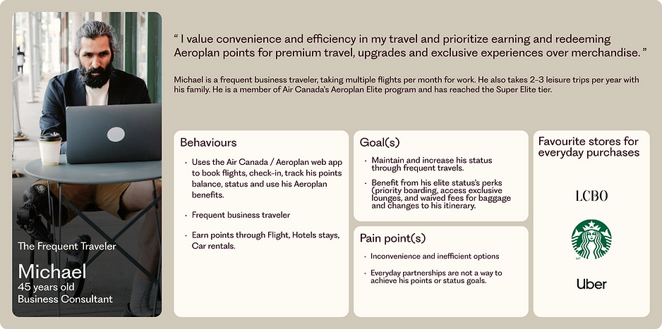
Primary personas
(Provided by Air Canada)

Users' Journey
To empathize with both personas, I’ve started to analyze their current user journey to find out that whether Michael or Rachel want to redeem or earn points, their current user journey is similar which provides them from having an experience that suits their unique goals and very distinct behaviours.
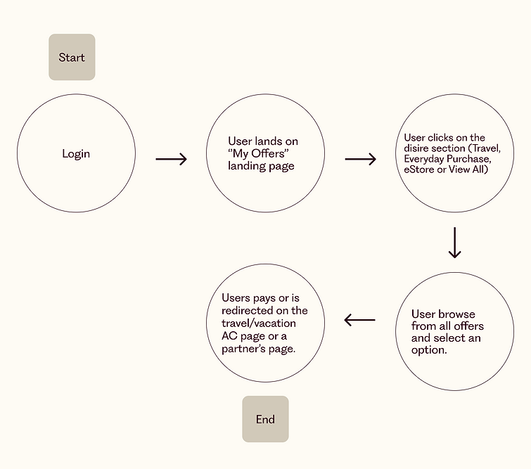.png)
User stories
To personalize an experience we need to understand each personas behaviours (desired action), roles and desired outcomes (benefits). With the insights that were given to Rachel and Michael, I was able to find users' stories that I regrouped under one main epic: I want to access perks and status options that are convenient to my everyday and travel habits so I can keep benefiting from my status level or reach a higher status faster.
User stories structure: “As a [user role] I want to [desired action] so that [benefit]”
Rachel
-
As an everyday earner, I want to find affordable options and opportunities so that I can earn points through everyday purchases.
-
As an everyday earner, I want to easily redeem points so that I can use my points for everyday purchases and travel options.
-
As an everyday earner, I want to understand the program's value so that I can be aware of the value of the different statuses.
Michael
-
As a Frequent traveller, I want to see convenient and efficient options so that I can attain and maintain elite status.
-
As a Frequent traveller, I want to get personalized perks so that I can be aware of the value of my status.
Main Epic
I want to access perks and status options that are convenient to my everyday and travel habits so I can keep benefiting from my status level or reach a higher status faster.
Design Solution
The Aeroplan program is based on giving the possibility to benefit from a status that differentiates users from other program members or none members.
I've decided to recreate a place for Rachel and Michael that is a reminiscence of their status, where they can feel proud of it and benefit from their many privileges.
Creating a home
What is more personal than a home, a place where you can create your own space that is suited to the way you behave? The home page is where the user first land and making it personal is the very first step to improve personalization and bring forward the status values.
The design of the home page was based on creating a unique experience for the unique needs of each persona. To make this possible, I've decided to add features based on two pillars, natural intelligence and artificial intelligence, to balance each other.
While customization (natural intelligence) will allow Michael and Rachel to be in control and get exactly what they want, personalization through a system (artificial intelligence) will deliver automated content that matches their unique preferences.
UX Improvement
Improving the current journey with new features
To meet Rachel's and Michael's unique needs, I had to add features that will make their current journey different from each other while still creating a space that will be familiar if their status change over time.
Geolocated suggestions
Users can get offers suggestions based on their localization to earn points in physical stores through the Aeroplan credit card.
Desired Outcomes
-
Provide convenient options to increase engagement.
-
Reduce time spent looking for physical stores that can help boost points to favour conversion rate.
-
Extend the experience to a physical space to offer convenient options for earning more points on a daily basis, no matter where the user is.
Saved Items
Users can save their favourite offers in different categories.
Goal
-
Reduce the number of steps to find offers that users were interested in on a previous visit session to increase engagement and conversion rate.
Notifications
A red dot with a ''NEW DEALS'' tag appears when there are new offers that could interest the user.
Desired Outcomes
-
Provide convenient options to increase engagement.
-
Warn users so they don't miss an offer, making them navigate through different sections of the My Offers page, which increase the time spent on the platform.
Favourite stores section
Users can access their favourite stores based on their passed purchases.
Desired Outcomes
-
Reduce the number of steps needed to access the page of a store that users are used to visiting to favour engagement and conversion rate.
Upcoming travels
Users can book hotels, rent a car or Uber rides for their upcoming travel. Suggestions are based on available options during the user's stay.
Desired Outcomes
-
Provide convenient options to increase engagement.
-
Help users find complimentary perks that will help them maintain or gain higher status, which can lead to longer sessions and ultimately increase the conversation rate.
UI Improvement
Creating personalization through UI elements
To emphasize the personalization, colour associated with the status was injected through the whole design so users' pages evolved as their status evolves.

Final prototype
After completing the initial phases of sketching and wireframing, I recognized the importance of collaborating with my peers to ensure a smooth development process and seamless data collection. By seeking feedback and joining forces with the software engineers, we aimed to identify and address any potential technical challenges. This collaborative approach helped reiterate my design and create bring a user-friendly design solution that was technically feasible and easily implementable.


Key Takeways
Overall, I am delighted with the outcome of my design solution, considering the challenging time constraints. Being the sole UX designer on this project posed its difficulties, but I successfully conveyed the value proposition of my design while effectively leading and coordinating with the development team for the website's creation. Although I primarily focused on designing the homepage, I am confident that given more time, I could have further enriched and expanded the project in many ways.
What I would have done with more time
-
Enhance the user flow by improving the animation to increase engagement.
-
Test my flow by conducting user tests and reiterating based on their feedback.
- Develop all flows since I've only focused on the Upcoming Travel and the Saved Offers flows.
-
Solidify the architecture as a whole by making a card sorting activity to create a more intuitive navigation structure.
-
Explore other visual directions and validate with users.
-
Developed a responsive design that includes tablet and mobile views.
-
Spend more time searching for AI technology that would support the experience.