
Case Study
Regen
Roles
UX Researcher
UX/UI Designer
UX Copywriter
Marketing Strategist
Tools
Figma
InVision
Descript
Pen & Paper
Type of project
Solo Project (Capstone of UX Bootcamp)
Operating System
iOS mobile
Timeline
8 weeks
Video by Ton Souza

Have you ever gone through your social media feed and got inspired by a beautiful landscape?
Photo by Tomas Anunziata

While trying to find your next trip activity, have you ever googled "most beautiful views", "hidden places" or "best things to do"?
Photo by Martino Grua

But if everyone does visit the same beautiful sights what will be the environmental impact of having too many people visiting them?
Video by Mikhail Nilov
I was determined to find a solution that will allow travellers to fulfill their passions while preserving our planet.
That's when I envisioned a digital innovation that balances the joy of travel with a positive impact on the environment.

Product Overview
Regen is a minimum valuable product (MVP) that answers a current lack in the sustainable tourism market, fulfilling eco-conscious tourists' needs to travel without making them feel guilty in the process.
The app allows users to create an interactive travel itinerary filled with a plethora of sustainable options from activities to transportation that will get them from point A to point Z.
The app allows users to create an interactive travel itinerary filled with a plethora of sustainable options from activities to transportation that will get them from point A to point Z.
Design Solution
Outcome
After introducing the product to eco-conscious millennial travellers (target users), I was impressed to see that they were all thrilled with the fact that they won't have to think about what it implies to travel sustainably anymore because the app does it for them, all they have to do is get inspired by pictures, eco-friendly activities, locals stories and add places to their trips with the tip of a finger.
Method
Finding a design solution to a problem is not a linear process so I’ve decided to use The Double-diamond Method to guide the structure of my approach. This method was particularly helpful in emphasizing user-centred thinking, helping me be more creative, and ensuring better design solutions through iterative prototyping and testing.
Concept by he British Design Council
Secondary Research
First, I needed to get more clarity on the current market so I could have a better understanding of the problems in space. I've found 5 insights to help me develop my primary design challenge statement.
THEMES
MARKET INSIGHTS
The beauty of places as inspirations
When it comes to what inspires people to travel more sustainably, Booking.com reported 60% of travellers indicated that they found the impressive natural sights visited on past travels as their inspiration.
The access to sustainable property
According to Booking.com’s research, out of 40% of travellers that haven’t stayed in a sustainable property in the past, 31% said that they didn’t know how to find them.
The lack of options
49% of travellers were still believing that in 2021, there simply aren’t enough sustainable travel options available.
Millennials, the most eco-conscious travellers
According to the Sapient Sapient report, Millennials are slightly more likely than Gen Z and Gen X to say that sustainability plays a vital role in where they travel, with 2/3 saying they agree with the statement, versus 64% of Gen Z and 54% of Gen X
Being sustainable while travelling
83% of global travellers think sustainable travel is vital.
Problem Space
Problem Statement
Eco-conscious travellers know that travelling sustainably is vital, but don't have enough options to choose from or don't know where to find them.
Why this problem statement?
The problem statement identified is that travellers who value sustainable travel are faced with a challenging dilemma.
The objective of addressing this problem is to bridge the gap between travellers' aspirations for sustainable travel and the available options.
Norrowing down this problem space helped me crafted a HMW that would get me closer to solving this design challenge.
How Might We...
Design Challenge
How might we help millennial travellers make ecotourist decisions when planning their next trip to preserve the beauty of the environment they were inspired to visit?
Interview Strategy
To understand the current sustainable travel market and make sure my design challenge was aligned with the reality of current eco-conscious millennials, I've conducted primary research by interviewing multiple users.
Target Users
To make sure that the app is successful at its early stage, the target users will be millennials since they are most likely to be frequent travellers in the upcoming year and think sustainable travel is more vital to them than Gen Z.
Target Demographics
-
Millennials aged between 30 - 40 y/o
-
Must have travelled in the last 4 years
-
Must be environmentally conscious
-
Must use technology for planning a trip or during a trip
Intermediate
-
Virtual over Goole Meets
-
Each participant was in their apartment
-
Transcripted with Descript
Interview Guidelines
QUESTION THEMES
ASSUMPTIONS
The travel history and the motivations behind them.
Millennial tourists' key motivation to start or keep opting for sustainable options while travelling is to preserve the beauty of the environment.
What it means to travel sustainably and how important it is.
Millennial tourists have varying degrees of understanding of sustainable travel practices and their travel experience influences their perspective on the impact of travel on the environment and local communities.
The access to sustainable options while travelling and constraints.
The main reason millennial tourists don't opt for sustainable options when travelling is that they don't know they exist.
Interviews Outcomes
01.
Tourists are often skeptical of eco-friendly options offered by airlines and big accommodation corporations.
02.
Tourists' environmental concern doesn't influence the choice of a destination, but once a destination is chosen, they are more likely to look at the eco-friendly options it offers.
03.
Tourists are more likely to take action when eco-friendly options are communicated by local groups.
04.
Time and money are the main factors that influences users decision when choosing between sustainable or non sustainable accommodation or transportation.
*05.
Receiving information on their environmental impact, make tourists feel guilty but they prefer to closer their eyes on their environmental values in order to travel.
Primary Reasearch Key Insights
*
The guilt that comes from the desire to travel VS the environmental values.
Going through this stage of the research helped me find out that even though making eco-responsible gestures on a daily basis is part of their values, the feeling of guilt prevents our target users from opening their eyes to the options that would lead them to travel sustainably.
Furthurmore, I found that eco-conscious travellers mainly take action during their travel and are still solicited to take action in the booking process of their trip.
I've decided to emphasize those two states of the user travel journey and the culpability guilt that occurs in a new HMW question.
Revised How Might We
How might we help millennial travellers make ecotourist decisions when planning and during their trip to preserve the beauty of the environments they were inspired to visit and reduce their culpability guilt in the process?
Persona
The person behind the primary users
To avoid biased opinions while designing and creating a user-centred solution, I've created a persona representing the target users by using the insights and quotes from my interviews.
.png)
Picture by Nataliya Vaitkevich
Experience mapping
By creating a persona and going through an experience map exercise, I was able to understand the primary user goals and frustrations and realized that there are two distinct stages in Katherine's travel journey.
.png)
PHASE 01
Booking transportation & accommodation
The opportunity here was to help her reduce the time spent looking for sustainable alternatives and reduce her stress by assisting her in the search for sustainable travel options.
PHASE 02
Planning activities
The opportunity here was to help her lower her anxiety and guilt by:
-
Giving her sustainable activities and examples she can do during her trip.
-
Giving her tips on how she can help local cultures while she’s on the trip.
-
Giving her options for making sustainable gestures when in nature.
User stories
To understand Katherine it was imperative to emphasize with her by writing user stories based on her behaviours (desired action) as an eco-conscious traveller (user role) and her desired outcomes (benefits). I came up with 30 user stories all connected with the focus theme and divided them into 4 distinct epics.
User stories structure: “As a [user role] I want to [desired action] so that [benefit]”
Epics
01.
I want to learn how to make more sustainable choices while travelling
*02.
I want to plan an eco-friendly itinerary
03.
I want to receive and share recommendations to be inspired or inspire others.
04.
I want to book sustainable accommodation, transportation and activities when planning a trip.
Main Epic & User Stories
*
As an eco-conscious traveller, I want to plan en eco-friendly intinerary.
Building an eco-friendly itinerary will help Katherine find multiple sustainable options and will help her feel reassured that she is making responsible choices and continuing to minimize her impact.
This can help alleviate any guilt she may have about travelling, knowing that she is taking steps to mitigate her impact during both phases of her journey.

Task Flow
To design an intuitive, efficient and effective solution, I mapped Katherine's journey based on a main task that was common to all my interview data and that covers all the user's stories of the main epic.
Analyzing potential pain points and areas where Katherine may get stuck within this map, I ended up with the following task flow.
CHOSEN USER STORY
As an eco-conscious traveller, I want to add a restaurant that uses local products to my next trip itinerary so that I can encourage local production and economy.
USER TASK
Plan an activity that helps preserve the local environment.

Sketches
I created a UI inspiration on inVision and took inspiration from Dribble, Behance, and iOS app versions of Instagram, Pinterest, Autio and Airbnb Experience to guide me when sketching my first concept screens with a pen and paper.
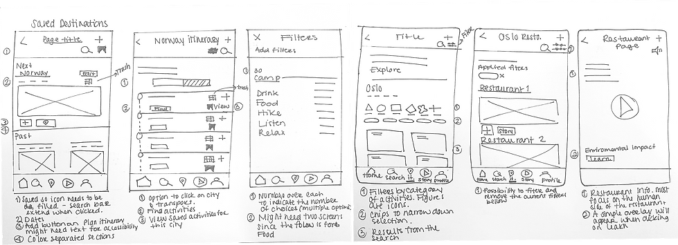
Low-Fidelity Wireframes
After sketching, I've created grayscale low-fidelity wireframes on Figma following Human Interface Guidelines for iOS. To be able to test them, I took the wireframes and added the writing content and brought Katherine’s user flow to life by prototyping the frames.
To make sure that users keep their focus on the typography, voice tone and functionalities I've used different shades of grey while and optimize the accessibility.


User Tests
Once the prototype was done, it was time to connect with target users to uncover any sources of friction that they might face while using the app and validate that the design solution resolves the design challenge before finalizing it.
To make sure that the app reaches the set goals, I did two rounds of user tests and each of them consisted of 5 tests with 5 different testers that fit the app's primary user profile, i.e. eco-conscious millennial travellers.
By using a prioritization matrix to evaluate I was able to pinpoint the issues that I was able to solve in the given time frame.
1
PERCEIVED ADDED VALUE Not being an app where you can do all things related to planning a trip kept the user from seeing the added value of using the app, which can ultimately make them continue using the apps that they use on today's market and prevent them from stopping the vicious cycle define in the problem space.
SOLUTIONS
VALUE FOR KATHERINE
Add a transportation Flow
-
Offering her more sustainable options when planning and during her trip to build an eco-friendly itinerary with lower environmental impact.
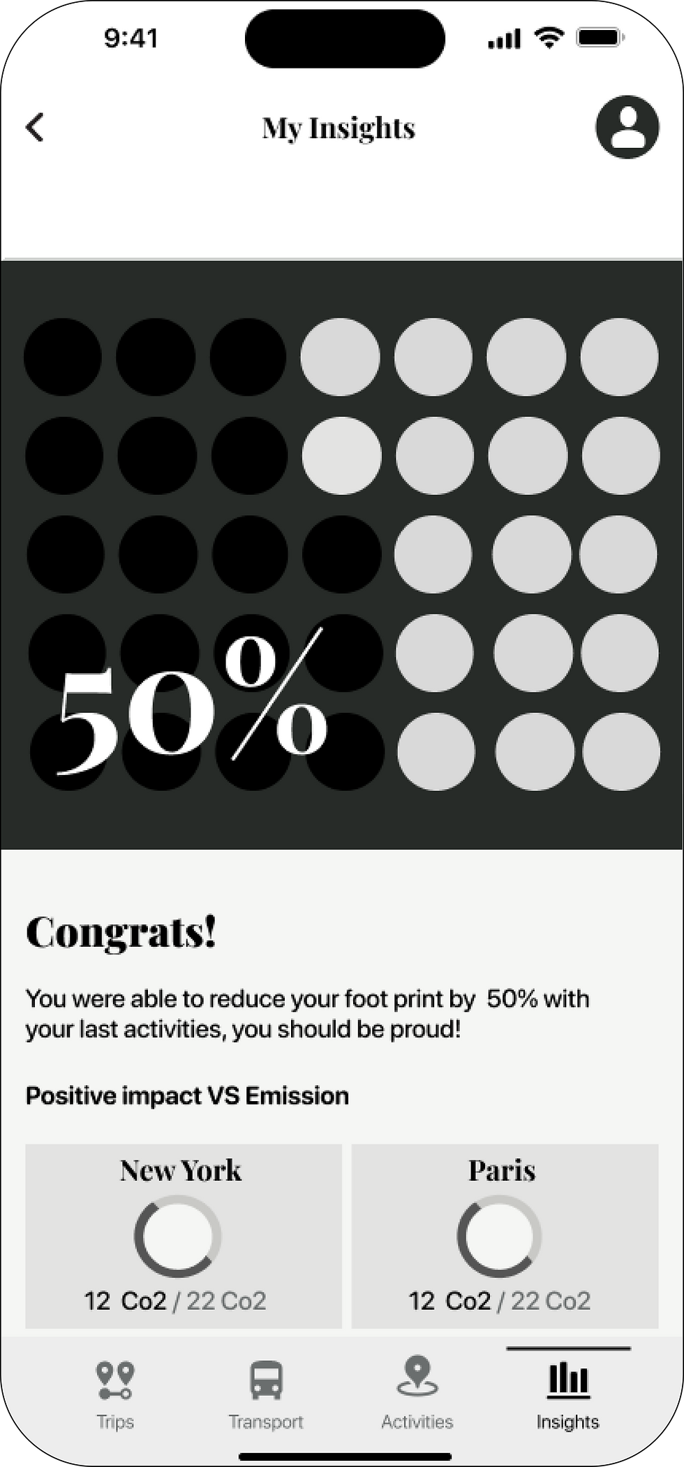
Add an insight flow
-
Stop the guilt cycle by seeing her progress and making her feel more confident that her trip is having minimal impact on the environment.
-
Stop the guilt cycle by creating an empowering experience to encourage her to keep opening her eyes on sustainable options for future trips.
NEW TRANSPORTATION FLOW
EPIC
Booking Transport
TASK
Browse local transportation options.
USER STORY
As an eco-conscious traveller, I want to browse transportation options that are better for the environment so that I can lower my environmental footprint.


.png)
NEW INSIGHTS FLOW
EPIC
Travelling sustainably
TASK
See how I contribute to preserving beautiful sights.
USER STORY
As an eco-conscious traveller, I want to contribute to preserving the sites I’m visiting so that I can lower my environmental impact.

2
SUSTAINABLE IMPACT NOT VISIBLE ENOUGH Not being able to see the environmental impact before landing on the transporter's or activity provider's page prevented users from making an informed decision and comparing which choice is best.
SOLUTIONS
VALUE FOR KATHERINE
OUTCOMES
Create a sustainability ranking system
-
Getting a clearer understanding of sustainability.
-
Provide a clear framework for comparison.
-
Have a visual reference to scan the sustainable impact more easily.
Helped the second round of testers to scan information more easily and determine what were the best sustainable options.
Enhance the sustainability impact in key places.
-
Make an informed decision about which options to choose.
-
Increase trust in activities and transport providers by holding them accountable for their sustainable practices.
The use of chips on providers' cards helped the second round of testers scan the information faster.
When on the provider page, users' main goal was to get information about the restaurant and how much better it is for the environment, so having a more dominant pop-up screen that explains the provider's sustainability was a nice surprise to them.
LEAF RANKING SYSTEM BEFORE & AFTERS

before
.png)
after

before
.png)
after
SUSTAINABLE VISIBILITY BEFORE & AFTERS

before
.png)
after

before

after
3
LACK OF INTERACTIVITY Since the itinerary was created individually, the time spent combining the activities of each travel partner is not significantly reduced compared to what they currently do, which can lower conversion rates or bring people to stop using the app.
SOLUTION
VALUE FOR KATHERINE
OUTCOMES
Make the itinerary interactive to add travel buddies.
-
Save time creating an itinerary by not having multiple independent lists to combine.
-
Get the exciting feeling that she loves so much when discovering new activities suggested by people who know what she likes or that will get her out of her comfort zone.
Introducing the interactive itinerary feature elicited an overwhelmingly positive response from users as it empowered them to collaboratively plan trips with their loved ones.
This not only facilitated simultaneous planning but also nurtured seamless coordination, allowing them to curate an itinerary that encompassed activities enjoyed by everyone, thereby enhancing the shared travel experience.
BEFORE & AFTERS
after

before

before

after

4
CONFUSING TAB BAR The tab bar is too cluttered which is confusing to users and keeps them from understanding how to navigate through within seconds.
SOLUTION
VALUE FOR KATHERINE
OUTCOMES
Reduce the number of sections.
-
Get more clarity on the tasks she can accomplish on the app.
-
Accomplish her task more efficiently.
Adding access to the 3 main features of the app made it super easy for the users to jump from one task to another during the second round of testing.
BEFORE & AFTERS
Version 1
.png)
Version 2
.png)
Version 3

Brand development
Now that my prototype functionality was optimal, it was time to inject colour theory principles, icons and images in order to bring emotion out of the digital design and connect with Katherine, our target user.
GOAL
To create a cohesive and consistent image through the brand identity, where the users feel enthusiastic, motivated and uplifted about travelling more sustainably.
Brand Adjectives
To create a product that brings emotion and not only functions, I came up with brand adjectives that fit the target users' behaviours and that can help overcome their pain points.
.png)
Moodboard
To set a strong foundation for the product's storytelling, I've gathered images that evoke each adjective and regrouped to create a mood board. Then, I combined the images to create a cohesive mood board which helped me start building strong storytelling.

Colour Theory

Connecting
Evolving
Welcoming
Primary Color
To represent the re-connection with sustainable travel and the evolution of nature, green was used as a primary colour. The ecological guilt that users are experiencing during their current travel journey makes them feel stressed.
To bring a welcoming feeling, the app needed to feel like a big warming hug that deviates any stress so the use of a darker green was perfect to serve that purpose.
COLOR THEORY
UI DESIGN
After seeing that green really did have a calming effect on my testers and to push further I've intentionally avoided orange and used only green when it comes to the transportation section, where Katherine was the most stressed.
Secondary Color
COLOR THEORY
To bring energy into the design, create excitement and give the spirit of adventure, orange was the perfect fit for a secondary colour.
The complementarity of green and orange was perfect for accessibility purposes as they made the CTA’s button stand out but still remaining harmonious.
UI DESIGN
What Katherine looks for when travelling, is the excitement of getting out of her comfort zone when discovering new places, in contrast with the green in the transport section, orange was injected to a greater extent in the activity section to bring that excitement.

Dynamic
Evolving
Uplifting
Brand name
Now that my colours were selected, I was able to think of a name. I started to write down themes that could embody the brand, the functionality of the app, the problem space and our primary users and their relationships with sustainable travel.
LIST OF NAMES
Leave No Trace
-
No.trace
-
Notra
-
Nostra
-
Notra.i
-
REtrace
Itinerary
-
iTineray
-
ITin
-
i.trace
-
iTT
-
Travel.it
-
Trav.I
Regenerative Travel
-
Regenerative
-
Gen
-
reGEN

regen
Rethinking travel
for the next generation
"reGen" is a short and memorable word that connotes ideas of renewal, growth, and positive change. These associations make it a fitting name for an app that aims to have a positive impact on its users' travelling behaviours and that helps users improve or rejuvenate themselves in some way.
The word "regen" is easy to spell and pronounce, which can make it easier for people to remember and recommend the app to others.
Picture by Dmitriy Zu
Wordmark
Throughout this wordmark, I wanted to still communicate the brand adjectives to stay coherent and bring that strong identity in the smallest details and maintain the connection with Katherine.
To guide me in designing a wordmark, I decided to set some guidelines for each adjective to start ideating.
.png)
Typography
Due to time constraints, I knew I had to approach my typography research methodically. Sketches proved to be the most effective way to consider all my ideas and identify key aspects to focus on in typography.
PEN & PAPER SKETCHES

LOGO

TYPOGRAPHY

Final results
.png)
.png)
.png)
.png)
Picture 1: Stayhereforu, Picture 2: Luizph, Picture 3:Gaspar Zaldo
UI Interface
To bring the old and the new, I paired the sans serif typeface SF Pro Rounded and the serif font Playfair Display. The SF Pro was used as a primary typeface for its high accessibility and versatility with other fonts and because it is widely supported by Appel’s operating system as well as other platforms and devices.
PARAGRAPHS & CAPTIONS
STYLES AND WEIGHT


HEADINGS
STYLES AND WEIGHT


UI Color Accessibility
ACCESSIBILITY
For accessibility purposes, I've incorporated lighter colours to bring more contrast throughout the final design.
After multiple tests, I was able to reach the AAA classification of the WCAG guidelines for most color combinations. To make the gradient as accessible as possible and still give that dynamism, they are meant to be use on a buttons that uses a big and simple icon.


Key Takeways
Next steps
Broaden the booking options
Developing the complete booking task flows for any type of transport and activities (restaurant reservation, concert, guided tours, etc).
Accessibility
-
Add more inclusive tourism options for activities and transport
-
Keep improving accessibility and have user tests with people that have disabilities to adapt my prototype and marketing website.
-
Add video description
Environmental Impact
Improve the measurement of the environmental impact in the insights sections with the help of an environmental specialist.
Key learnings
The right answers come with empathy
Environmental subjects are no easy subjects to tackle. This conversation is even less easy to talk about with people coming from multiple confinements after the pandemic.
As a designer, I will have to talk about touchy subjects, but as a human-centred designer, my empathy and my neutrality when I’m in front of my interviewee will help them open up, and will help me come up with design solutions that will lead to better solutions, to a better world maybe.
Listen, observe, and remember
When I felt like I didn’t know what direction to take for the design decisions, I always took a step back and think about what my interviewees and testers told me.
By thinking of injecting all these insights into the smallest details of the prototype, I was always able to find the right answer and make sure my design decision reflected the humans behind it.